Online HTML Table Generator and Styler
HTML tables allow to organize and display data in rows and columns on web pages. Our free online code generator and styler allows you to create HTML tables easily with just a couple of clicks. Add headers and footers, pick from the predefined styles and adjust the code with the interactive editors.
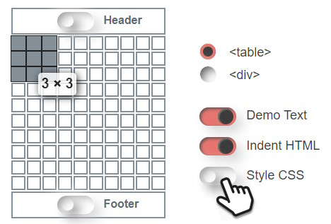
Adjust the settings according to your needs and see the HTML table update instantly.
| Model | Price | Range | 0-100 | |
|---|---|---|---|---|
| Model S | 83,900 | 651 | 405 | 1.99 |
| Model 3 | 42,900 | 437 | 272 | 3.1 |
| Model X | 99,990 | 564 | 351 | 2.5 |
| Model Y | 54,990 | 531 | 330 | 3.7 |
| USD | km | mi | sec | |
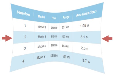
A sortable demo table.
Hover your mouse to reveal the edit icon. Click the pencil to send it to the interactive editor.
What Are HTML Tables?
HTML tables are used in web pages to present tabular data. They allow web developers to arrange data into rows and columns. Tables are useful for various tasks such as presenting text information and numerical data.
 |
Header with navigation link | ||
| Side- bar |
Layout with HTML Tables |
Meta data | |
|
This is an example to demonstrate how to use tables to position the sections of a web page.
This demo has the borders displayed for a better visibility but you can hide them with a little CSS trick: |
|||
Author image |
Author bio and other details. | ||
| Footer with links, copyright, privacy policy and others. | |||
In the early days of the internet, tables were used to lay out the sections of the pages, such as the header, sidebars, etc. They can even be used to float an image next to a paragraph. This approach however works only for fixed-width pages. Nowadays it's recommended to use DIV tags instead, which allows you to stack the elements on narrow screens, like mobile phones. Responsive sites no longer support to build the whole page with tables.
HTML Table Scructure
HTML tables are defined by the <table> tag, which contains one or more <tr> tags for rows, and one or more <td> tags for table cells. Each cell can hold any HTML content, such as text, images, lists, divs and even other tables.
<table>
  <thead>
    <tr><th>Head 1</th><th>Head 2</th></tr>
  </thead>
  <tbody>
    <tr><td>A</td><td>B</td></tr>
    <tr><td>C</td><td>D</td></tr>
  </tbody>
  <tfoot>
    <tr><td>Foot 1</td><td>Foot 2</td></tr>
  </tfoot>
</table>
| Head 1 | Head 2 |
|---|---|
| A | B |
| C | D |
| Foot 1 | Foot 2 |
A simple example with header, regular cells and footer
<th> tags are optional for table headers, which are usually bold and centered by default.
To add a caption to your table, you can use the <caption> tag.
To group together all the cells in a column for styling purposes, you can use the <colgroup> and <col> tags. To separate the header, body and footer of your table, you can use the <thead>, <tbody>, and <tfoot>tags
Styling With CSS
Using CSS code we can create beautiful tables that match the website design.
| Model | Price | Range |
|---|---|---|
| Model S | 83,900 | 405 mi |
| Model 3 | 42,900 | 272 mi |
| Model X | 99,990 | 351 mi |
| Model Y | 54,990 | 330 mi |
| USD | Miles |
| Model | Price | Range |
|---|---|---|
| Model S | 83,900 | 405 mi |
| Model 3 | 42,900 | 272 mi |
| Model X | 99,990 | 351 mi |
| Model Y | 54,990 | 330 mi |
| USD | Miles |
The online table generator can help you style your tables.
Activate the Style CSS toggle button and pick from the design gallery or start setting up your styles from scratch.
Trick And Tips
Use Div Tags
 Using structured <div> elements we can create responsive tables that are mobile-friendly and look good on small screens too.
Our generator can create tables using both traditional table tags and div tags. Make sure to select the ones you want to use. Convert your existing tables with the converter at DivTable.com
Div Tables »
Responsiveness
 Website content, including tables need to look great on both desktop and mobile devices. Here you can find tips and tricks about how to make tables look great on all screens sizes.
Responsive Tables »
Sticky Header
Some tables can grow very tall. Instead of taking up the whole screen you can make them scroll with a sticky header.
Sticky Header »
Sorting Rows
Use JavaScript to reorganize rows in alphabetical or numerical order. Enables to click a column header to sort the table.
Sorting »
Nested Tables
A way of organizing data or information in a grid-like structure, where each cell can contain another grid. This allows for more complex and hierarchical layouts. For example, you can create a calendar, where each cell represents a day and contains another grid with the events for that day.
Start Nesting »

