How CSS Flexbox Layout Works?
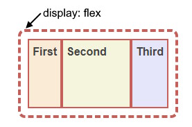 The CSS flexbox layout works by creating a flex container that contains flex items.
The flex container can be any HTML element that has the display property set to flex or inline-flex. The flex items are the direct children of the flex container.
The flex container has two axes: the main axis and the cross axis. The main axis is defined by the flex-direction property, which can be row, row-reverse, column, or column-reverse. The cross axis is perpendicular to the main axis. The flex items can be aligned and distributed along both axes using various flexbox properties, such as justify-content, align-items, align-content, flex-grow, flex-shrink, flex-basis, and order. Flexbox allows you to create flexible and responsive layouts that adapt to different screen sizes and orientations.
FlexBox explained in 2 minutes
<div style="display: flex;
    flex-direction: row;
    border: 4px dashed #c55f59;
    padding: 10px;
    border-radius: 10px;">
      <div style="height: 100px;
          background: AntiqueWhite;
          border: 2px solid #c55f59;
          padding: 5px;">
        First</div>
      <div style="width: 100px;
          border: 2px solid #c55f59;
          padding: 5px;
          order: 0;
          background: Beige;">
        Second</div>
      <div style="background: Lavender;
          border: 2px solid #c55f59;
          padding: 5px;">
        Third</div>
</div>
Display:Flex Property For Wrapper
The parent element has to have the display: flex or display: inline-flex assigned. Flex items are all direct children of the wrapper. We can define 2 kinds of flex wrappers:
- flex – block element.
- inline-flex – inline flex wrapper.
Flex-direction
The flex-direction CSS property sets how flex items are placed in the flex container defining the main axis and the direction (normal or reversed). The possible values are row, row-reverse, column, and column-reverse. The default value is row, which means the flex items are displayed horizontally, as a row.
You can use this property to change the layout of the flex items according to your needs.
<div style="flex-direction:row"
 class="flexBox">
  <div>A</div>
  <div>B</div>
  <div>C</div>
</div>
Justify-content Property
The justify-content CSS property defines how the browser distributes space between and around content items along the main-axis of a flex container, and the inline axis of a grid container.
The possible values are center, start, end, flex-start, flex-end, left, right, space-between, space-around, space-evenly, and stretch. The default value is flex-start, which means the items are positioned at the beginning of the container. You can use this property to align the items horizontally or vertically depending on the flex direction.
(default)
Flex CSS Property
The flex CSS property is a shorthand property for flex-grow, flex-shrink, and flex-basis properties. It is used to set the flexible length on flexible items. The flex property determines how much the flex item will grow or shrink relative to the rest of the flex items in the flex container. The syntax of the flex property can be one, two, or three values.
For example, flex: 1 0 auto means flex-grow: 1, flex-shrink: 0, and flex-basis: auto. The default value of the flex property is 0 1 auto.
Item Order Property
The order CSS property sets the order to lay out an item in a flex or grid container. Items in a container are sorted by ascending order value and then by their source code order. The order property takes an integer value that represents the ordinal group of the item.
The default value is 0, which means the items are displayed in their original order. You can use this property to change the visual order of your items without changing the source code order. However, you should be careful not to create a disconnect between the visual presentation and the logical order of your content, as this can affect the accessibility of your document.
<div class="flexBox">
  <div style="order:0">0</div>
  <div style="order:2">2</div>
  <div style="order:1">1</div>
  <div style="order:3">3</div>
</div>
<div class="flexBox">
  <div style="order:5">5</div>
  <div style="order:2">2(1)</div>
  <div style="order:2">2(2)</div>
  <div style="order:-2">-2</div>
  <div style="order:0">0</div>
</div>
Flex-wrap Property
The flex-wrap CSS property sets whether flex items are forced onto one line or can wrap onto multiple lines.
If wrapping is allowed, it sets the direction that the lines are stacked. The possible values are nowrap, wrap, and wrap-reverse. The default value is nowrap, which means the items will not wrap and may overflow the container. A value of wrap means the items will wrap onto multiple lines from top to bottom. A value of wrap-reverse means the items will wrap onto multiple lines from bottom to top.
(default)
The container width is limited to 200px.
Aligning Items in a Flexbox
Align-items Property
The align-items CSS property sets the alignment of flex items on the cross axis, which is perpendicular to the main axis.
The possible values are normal, stretch, center, start, end, flex-start, flex-end, self-start, self-end, and baseline. The default value is normal, which behaves differently depending on the layout mode.
A value of stretch means the items will stretch to fill the available space on the cross axis.
A value of center means the items will be centered on the cross axis.
A value of start or flex-start means the items will be aligned to the start edge of the container on the cross axis.
A value of end or flex-end means the items will be aligned to the end edge of the container on the cross axis.
A value of self-start or self-end means the items will be aligned to their own start or end edge on the cross axis.
A value of baseline means the items will be aligned along their baselines
The container has a fixed height.
Align-content Property
The align-items and align-content properties are both used to align flex items on the cross axis, but they have different effects depending on whether the flex container is single-line or multi-line.
The flex-wrap: wrap property has to be set, otherwise it doesn't work with the default nowrap.
The align-items property, presented above sets the default alignment of the flex items along the cross axis of each flex line. It affects the alignment of items on the current line, regardless of how many lines there are. The align-content property only applies to multi-line flex containers, and aligns the flex lines within the flex container when there is extra space in the cross axis. It affects the alignment of lines as a whole, not individual items. If the flex container is single-line, the align-content property has no effect. To summarize, align-items controls how items are aligned within a line, while align-content controls how lines are aligned within a container.
Summing Up What Flexboxes Do
Flexbox is a CSS layout module that allows you to arrange elements in a flexible way. It can help you create complex layouts that adapt to different screen sizes and orientations. With flexbox, you can align, distribute, and reorder elements along a single axis, either horizontally or vertically.
Flexbox is a powerful and versatile layout tool that can help you create responsive and modern web designs.
To use flexbox, you need to set the display property of the parent element to flex or inline-flex. This makes the parent element a flex container and its children flex items. You can then use various flexbox properties to control how the flex items are laid out inside the flex container. For example, you can use:
- flex-direction to specify the direction of the main axis (row or column).
- flex-wrap to allow the flex items to wrap onto multiple lines if needed.
- justify-content to align the flex items along the main axis.
- align-items to align the flex items along the cross axis.
- align-content to align the flex lines along the cross axis.
- flex-grow, flex-shrink, and flex-basis to control how the flex items grow or shrink in relation to each other.
- order to change the order of the flex items.
Is Flexbox Better Than Bootstrap?
Flexbox and Bootstrap are not exactly comparable, as they serve different purposes.
Flexbox is a CSS layout module that allows you to create flexible and responsive layouts with ease. Bootstrap is a CSS framework that provides a set of ready-made components and styles based on flexbox and other layout methods.
Use Flexbox For:
- Flexbox is better than Bootstrap if you want to have more control and customization over your layout, as you can use various flexbox properties to achieve different effects.
- Flexbox is better if you want to create simple and minimalistic layouts that do not require many components or styles.
Use Bootstrap For:
- Bootstrap is better than flexbox if you want to save time and effort, as you can use Bootstrap’s predefined classes and components to create complex and consistent layouts quickly.
- Bootstrap is also better if you want to use other features that Bootstrap offers, such as icons, forms, buttons, navigation, modals, etc.
There is no definitive answer to which one is better, as it depends on your project’s needs and preferences. You can also use both flexbox and Bootstrap together, as they are compatible and complementary. For example, you can use flexbox to create the main layout of your page, and use Bootstrap’s components to fill in the content.
Is Flexbox in HTML or CSS?
Flexbox is a CSS layout module, not an HTML element. You can use flexbox to style and arrange HTML elements in a flexible and responsive way. To use flexbox, you need to set the display property of the parent element to flex or inline-flex. This makes the parent element a flex container and its children flex items. You can then use various flexbox properties to control how the flex items are laid out inside the flex container.
Flexbox is a powerful and versatile layout tool that can help you create responsive and modern web designs.
Difference Between Flex and Flexbox?
Flex and flexbox are not different things, but different names for the same thing. Flexbox is the official name of the CSS layout module that allows you to create flexible and responsive layouts with ease. Flex is a shorthand property that combines three other flexbox properties: flex-grow, flex-shrink, and flex-basis. You can use flex to control how the flex items grow or shrink in relation to each other.
For example, you can use flex:
- to make all the flex items take up an equal amount of the available space.
- to make a flex item take up twice as much space as the others.
- to specify the flex-basis value to set the initial size of the flex item before any growing or shrinking happens.
Table
Body