Responsive HTML Tables
Responsive tables render their data correctly on both wide desktop and narrow mobile screens. We can make websites scroll to the right to reveal overflowing cells or stack some cells to make them fit mobile devices.
This article presents the most commonly used methods to make wide HTML tables mobile-friendly.
1. Scrolling Tables
Wide tables can be wrapped in a div element with overflow-x: auto; style. This solution is the most simple, intuitive for users and it works fine for tables where it's not necessary to see all columns at once.
<div style="width:280px;overflow-x:auto;">
  <table class="demo">
    <tr>
    <td>1</td><td>2</td><td>3</td><td>4</td>
    <td>5</td><td>6</td><td>7</td><td>8</td>
    <td>9</td><td>10</td><td>11</td><td>12</td>
    </tr>
    <tr>
    <td>A</td><td>B</td><td>C</td><td>D</td>
    <td>E</td><td>F</td><td>G</td><td>H</td>
    <td>I</td><td>J</td><td>K</td><td>L</td>
    </tr>
  </table>
</div>
| 1 | 2 | 3 | 4 | 5 | 6 | 7 | 8 | 9 | 10 | 11 | 12 |
| A | B | C | D | E | F | G | H | I | J | K | L |
Overflowing content can be revealed by scrolling / swiping to the right.
2. Hiding Negligible Columns
We can remove unimportant columns on narrow screens using the td:nth-child(x) {display:none} pseudo class.
The example below will hide its first and third columns when the browser screen is not wider than 1000 pixels. You can test this by manually shrinking your browser window.
@media (max-width:1000px){
  .shrinkingTable th:nth-child(1),
  .shrinkingTable td:nth-child(1),
  .shrinkingTable th:nth-child(3),
  .shrinkingTable td:nth-child(3) {
    display: none;
  }
}
| Order | Model | Price | Range | 0-100 |
|---|---|---|---|---|
| 1 | Model S | $83,900 | 651 km | 1.99 s |
| 2 | Model 3 | $42,900 | 437 km | 3.1 s |
| 3 | Model X | $99,990 | 564 km | 2.5 s |
| 4 | Model Y | $54,990 | 531 km | 3.7 s |
The "Order" and "Price" columns are hidden on mobile browsers.
3. Data-label CSS Trick
The table below switches to a list view automatically on mobile screens, using the @media (max-width:1000px){...} CSS media query, without using JavaScript. On narrow screens the table header is hidden and table cells are displayed as stacking block elements.
The most important part is the td::before{content:attr(data-label)} bit that displays the content of the data-label attribute before each cell.
Shrink your browser window to test this demo ⇲
The screen switches at 1000px.
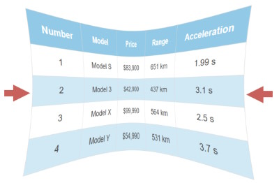
| Number | Model | Price | Range | Acceleration |
|---|---|---|---|---|
| 1 | Model S | $83,900 | 651 km | 1.99 s |
| 2 | Model 3 | $42,900 | 437 km | 3.1 s |
| 3 | Model X | $99,990 | 564 km | 2.5 s |
| 4 | Model Y | $54,990 | 531 km | 3.7 s |
<table class="responsiveTable">
  <thead>
    <th>Number</th>
    <th>Model</th>
    <th>Price</th>
    <th>Range</th>
    <th>Acceleration</th>
  </thead>
  <tbody>
    <tr>
      <td data-label="Number">1</td>
      <td data-label="Model">Model S</td>
      <td data-label="Price">$83,900</td>
      <td data-label="Range">651 km</td>
      <td data-label="Acceleration">1.99 s</td>
    </tr>
    <tr>
      <td data-label="Number">2</td>
      <td data-label="Model">Model 3</td>
      <td data-label="Price">$42,900</td>
      <td data-label="Range">437 km</td>
      <td data-label="Acceleration">3.1 s</td>
    </tr>
  </tbody>
</table>
.responsiveTable{width:100%;border-collapse:collapse}
.responsiveTable td,.responsiveTable th{padding:12px 15px;
border:1px solid #ddd;text-align:center;font-size:16px}
.responsiveTable th{background-color:#92c9e6;color:#ffffff}
.responsiveTable tbody tr:nth-child(even){background-color:#d1e8f5}
@media (max-width:1000px){
.responsiveTable thead{display:none}
.responsiveTable,.responsiveTable tbody,.responsiveTable tr,
.responsiveTable td{display:block;width:100%}
.responsiveTable tr{margin-bottom:15px}
.responsiveTable td{padding-left:50%;text-align:left;
position:relative}
.responsiveTable td::before{content:attr(data-label);
position:absolute;left:0;width:50%;padding-left:15px;
font-size:15px;font-weight:bold;text-align:left}}
HTML and CSS to change the table layout
4. Using Div Tables
The main reason for using <div> tags for building HTML tables is the support for responsiveness. Div tags are more flexible for supporting responsive layout and to optimize for mobile browsers. Div tables are great to build complex responsive that don't run over the edge of the screen.
Use the online HTML table to div converter or generate <div> tables with our tool. Making responsive div tables usually are custom built and they require CSS knowledge.
@media (max-width:1000px){
  .responsiveDivTable.divTable{display:block}
  .responsiveDivTable .divTableRow{display:block;
     border-bottom:2px solid #ccc;padding:5px 0px}
  .responsiveDivTable .divTableCell,.divTableHead{
     display:inline-block;border:none;padding:0px 5px}
  .responsiveDivTable .divTableHeading{display:none}
  .responsiveDivTable .divTableFoot{display:block}
  .responsiveDivTable .divTableBody{display:block}
  .responsiveDivTable .divTableCell:nth-child(1){
     display:none}
  .responsiveDivTable .divTableCell:nth-child(2){
     display:block;font-weight:bold}
}
Shrink your browser screen to see the demo div table collapse at 1000px.
Responsive HTML Table Generator
Use the online code generator below to create mobile-friendly tables for responsive websites.